Ghost of Igloi wrote:The real issue:
http://realinvestmentadvice.com/wp-content/uploads/2018/08/SP500-Rolling-20yr-TotalReturn-080118.png
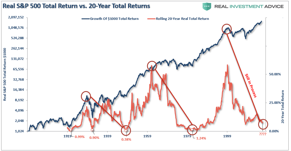
That's a very interesting chart, and it speaks to the value of dollar cost averaging. Sure, money invested right at those circled peaks earns nothing for the next twenty years, but the money invested during the troughs earns huge returns, with the net effect that average returns for money invested at frequent intervals, covering both peaks and valleys, earns a "decent" average return.
I tend to believe, after having stared long and hard at the chart I shared earlier, that right now is not the best time to put money in the US market (based solely on a naïve analysis of long term trends, like those embedded in your current plot). In my own case, I currently have no money in the US market (well, not zero, but less than 2% of my portfolio) because I think other markets are currently better valued.