“Professor Marathon” Sean Hartnett Has Calculated the Slope Of The Entire Boston Marathon Course

By Sean Hartnett
Published April 13, 2023
A week before the annual Patriot’s Day running of the B.A.A. Boston Marathon, retired UW- Eau Claire Geography Professor Sean Hartnett has produced a new generation of elevation and slope profiles of the famously hilly 42.195 kilometer, or 26.2-mile course.
“This was a bit of a rush job – just three weeks ago I received an inquiry from Boston course surveyor Justin Kuo and in the process discovered that LIDAR elevation data had recently become available for the Boston area on Google Earth.”
This high-definition LIDAR based topography data in Google Earth – is best evidenced with the appearance of 3D trees – and has facilitated the construction of a new generation of elevation profiles that also tracks slope data. Professor Hartnett constructed the current Boston Marathon profile in 2006 utilizing data collected with a high-end Trimble ProXR GPS that proved more accurate than available topographic maps, and actually holds up well when compared with the LIDAR elevations.
The LIDAR data is accurate enough to capture that the starting line across East Main Street in Hopkinton actually slopes slightly to the north, dropping from 470’ to 469’. While this high-definition topographic data base yields minor improvements in the accuracy of elevation data used to plot the profile, the high density of accurate elevations supports the calculation of accurate slope grades along the whole course at 100-meter intervals. Percent slope is calculated by determining the change in elevation (rise) over a given distance (run) then multiply by 100 to express the data as a percent. Uphill slopes have a positive percent such as +5.2%, and downhill slopes are negative such as -4.6%.
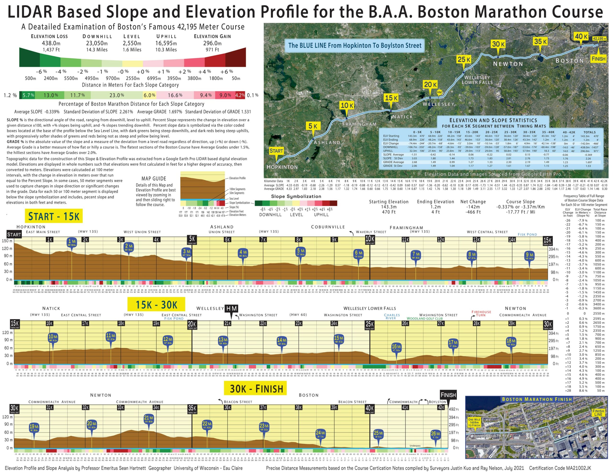
The calculation and symbolization of Slope is the most functional on-course expression of elevation for runners as it represents the angle of the road that they are traversing. Whether it’s changes in the slope angle of the foot plant, or the micro elevation slope between successive foot plants, toss in some gravitational forces and there is no doubt that slope impacts running performance – be it on the road or treadmill.
The slope is symbolized along the base of the profile with 100-meter squares and some 50- meter segments as rectangles. The slope boxes are color coded with dark greens being steep downhills, and dark reds being steep uphill, with progressively softer shades of greens and reds being not as steep and yellow being level. The maps work well on smart phones as you can zoom in on the profile for details. Printed right below the boxes are the actual slope values. Of note you can see that the Newton Hills all fall in the +4.6% – +5.2% range.
Significantly, this new generation of elevation profiles works on three levels – Elevation, Slope and Grade.
- the traditional ELEVATION profile graphs out the changing topography and is the various downhill, level and uphill sections of the course. As a graphic, it’s primary purpose is to visually portray changes in elevation, hills, or lack of hills along the course. The elevation profile visually captures the staircase nature of the Newton Hills can be seen with comparatively short climbs of 500-800 meters followed by longer 1,000-1,500 meters of level or downhill running. As profiles greatly exaggerate the elevation dimension, visual differences in the steepness of hills can be seen.
- The % SLOPE data relates best to the athletes’ actual racing experience with slope being like the angle on a treadmill. The key to easy interpretation of the slope data is breaking each kilometer into 100-meter segments. It is a distance short enough to have a rather uniform grade (though some 50-meter segments were used if there was a significant change of grade within the 100 meters). The 100-meters also reflects the athletes’ on-course experience as their racecourse vision of the road ahead is about 100 meters, and the math is very straight-forward, a +2.4% slope rises 2.4 meters over 100 meters, and a -4.2% slope drops 4.2 meters over 100 meters. The slope is symbolized along the base of the profile with 100-meter squares with the 50-meter segments as rectangles. The slope boxes are color coded with dark greens being steep downhills, and dark reds being steep uphill, with progressively softer shades of greens and reds being not as steep and yellow being level. Printed right below the boxes are the actual slope values.
- The GRADE data is the angle of the road regardless of up or down. Mathematically it is the absolute value of the Slope as both an uphill slope of +4.6% and a downhill slope of -4.6% have a GRADE that deviates 4.6% from level.
The higher the Grade, the greater the deviation from level, the hillier the course. Average Grade may be of value for athletes to compare how hilly are different sections of Boston. The Average Grade of a marathon course is probably most useful to compare How Hilly is a course, or maybe to compare Berlin and Valencia to which course is flatter. Collecting data in 50 or 100-meter intervals makes for a comparatively tidy data base for the summation and analysis of many aspects of a course’s terrain. Particularly useful is the average grade data which characterizes how hilly a course is. Eugene is the only other course I made with slope data, and it’s average Grade was 0.7578% compared to Boston’s 1.697.
The Average Grade statistic could also be used to compare how flat a course is, be it Berlin, Chicago or Valencia, but those maps will have to wait until Google Earth LIDAR data is available for those cities.
How the Map was Made
The construction of an Elevation and Slope Profile starts by mapping the course route or path in Google Earth. The certification notes recorded by Boston Course Surveyor Justin allow for the precise location of the start and finish as well as mile and kilometer marks along the route, and many painted markings are visible in Google Earth imagery. The course route distances serve as the horizon axis of the profile, and series of elevations are tabulated to form the vertical aspect of the graph, then shaded to enhance perception of course terrain. This map is designed for computer or smart phone use so you can zoom into a section of the course and slide along the course reading elevations labeled in both meters and feet.
While the brown shaded profile graph gives an overview of course topography, and the labeled elevations provide detail, it is the slope data that represents the most significant advancement of the LIDAR based elevation map. In the preparation of technical maps for the Tokyo/Sapporo Olympics and the 2022 World Championships for World Athletics, Professor Hartnett had been tasked with exploring methods of incorporating slope in the maps. Road Running Manager at World Athletics Alessio Punzi along with Jakob Larsen who oversaw competitions for World Athletics saw how tracking road slope figured prominently in cycling and wanted to explore ways to incorporate slope in the technical maps prepared for athletes, coaches and media.
After considering a variety of options, Professor Hartnett settled on tracking slope over 100-meter segments as it provided a very tidy distance for calculations of slope and also reflects the athletes’ on-course experience as their racecourse vision of the road ahead is about 100 meters. Percent slope is calculated by determining the change in elevation (rise) over a given distance (run) then multiply by 100, such that the change in elevation in meters over a 100-meter distance segment actually equals the slope percent. A 100-meter straightaway on a track is level and would have a 0% slope, if the straightaway ramped uphill 8 feet or 2.4 meters it would have a +2.4% slope, and if the straightway ramped downhill 5 feet or 1.5 meters it would have a -1.5% slope. The 100-meter segments worked fine for most of Boston’s course, but due to the undulating terrain 53 segments were split into two 50-meter segments to capture changes in slope direction like the crest of a hill, or if there was a significant change in slope over the 100 meters.
Grade is the absolute value of the slope and is the best measure of how hilly a course may be as it is a measure of the deviation from level, or a perfectly flat course. Downhill segments with a -3.0% slope and uphill segments with a +3.0% slope both have a 3.0% grade that deviate 3.0% from level. As such, the average course grade is the best measure of variance for assessing how hilly or flat a course may be.
Former marathon world-record holder Paul Tergat had a hand in one aspect of the design. I had prepared a profile graph of the NYC course in preparation for his dramatic sprint win over Hendrick Ramaala in 2005.
Similar to most profiles it was just a graph, and when going over the course and looking at the hill climbs in the old way of interpolating elevations from the graph line – first in feet and then converting to meters. While penciling in the pertinent elevations at the bottom of the graph, Paul had a straight-forward suggestion- “print all the data at the bottom of the graph so there is no need for interpretation, you get both the visual graph and the actual data.” Paul’s request for a data stream is particularly useful for the slope data which is listed at the base of the distance axis along with elevations in both feet and meters.
Known as Professor Marathon by world class runners Tergat and other members of the running community, Hartnett is quick to acknowledge two world class mentors that had seemingly prepared him for this specific task 40 years ago while he was completing his Ph.D. at the University of Wisconsin. “Renown cartographer Arthur Robinson taught me how to strive for proper if not perfect symbolization in the design of expert maps that efficiently communicate a great amount of information. I was also inspired by a class I took with Statistician Norman Draper and learned how to explore a variety of statistics in the analysis of variance and regression, and like Professor Robinson he believed that somewhere there was a perfect statistic for every distribution.
Slope Analysis of the Boston Marathon Course
After spending two weeks charting elevations in Google Earth Pro, and analyzing slope and grade data for each 100-meter segment, Professor Hartnett offers this assessment of the route from Hopkinton to Boylston Street.
Boston is indeed a very challenging and hilly course capped off by the steep climb up Heartbreak Hill at 33K (20.5 miles), yet almost half of the course is relatively flat with 19,245 meters or 45.6% having a grade less than 1.0%. That leaves the other 54.4% of the course chock full of hills from steep downhills, to rolling hills, to the revered four hill climbs in Newton.
The steepest slopes on the course are downhills exceeding -6.0% are found in the opening 5K, especially right at the start in the first kilometer. The rollercoaster start also features the steepest uphill is a short 50-meter bump up to +8.6% just after the kilometer mark. The course flattens out between 5K and 25K with a few rolling hills mixed in substantial flat stretches with grades less than 1.0%. A steep downhill starting just before 25K marks the transition into the stretch of hills that Boston is famous for. This 550-meter long downhill sustains a steady -5.5% slope before bottoming out crossing the Charles River Bridge at just 12.5m (41 ft.) above sea level.
The bridge crossing leads into Newton, and heads up a 1,100-meter-long gradual climb along the Woodland Golf Club, with most of the grade at +1.8 – +2.7% slopes, but 150 meters at +4%.
This first and longest of the fearsome foursome of Newton Hills, and as with the other climbs it is followed by 1,500 meters at a slightly downhill grade, leading around the Firehouse Turn onto Commonwealth Avenue. A block after the turn, the course on the west side of the boulevard pitches up sharply to +4.6% – +5.2% slopes over the 500-meter-long climb. Actually, the climb isn’t quite over as after 250 meters of some steep downhill, a 250-meter uphill begins at 29K (18 Miles) with slopes of +1.2% – +3.4% to finally finish off Hill #2.
A 1,700-meter-long gradual downhill slope flows past the white bell tower atop Newton City Hall, and the statue of John Kelly tucked away on the left side of the broad Walnut St. intersection.
The third Newton Hill starts immediately after the intersection with 300 meters at the now familiar +4.6% to +5.2% slope over a winding section of the boulevard. The hill continues another 400 meters at +1 – +3% slope, cresting at 31.6K (19.6 Miles), followed by 900 meters of slightly downhill or level grades, before the start of Heartbreak Hill at 32.5K (20.2 Miles).
The fourth and final of the Newton Hills climbs 29.9 meters (98 feet) over 800 meters with the middle 400 meters at +4.9% – +5.2% slopes. Rising up over a small second crest, Heartbreak Hill finishes with a steep 800-meter downhill stretch, much of it at -4.0% – -5.2% slope.
After the roller-coaster run over the Newton Hills, The final 8 kilometers trends downhill or flat with the only significant hills being the I-94 overpass just past 40K, and the Massachusetts Ave. underpass that features a 50-meter climb at +5.8% slope at 41.5 just under a kilometer from the finish.
Turning right onto Hereford St. the course run slightly uphill for two blocks before turning left onto Boylston St., and its 575-meter-long finishing straight nearly as flat as a track.
Professor Hartnett’s suggestions are to prepare from the extreme slopes be it the -4% to -8% downhills or the steady dose of +4.6% to +5.2% climbs through the Newton Hills. Train on both steep up-hills and downhills, or take to a treadmill and set it at a +5% incline. Unfortunately, there is no treadmill simulation for Boston’s downhills as most treadmills max out at a -3% decline.