I like the Asics ones until you put a number on, and then its hard to see the coolness. They really need to figure out what will look good, on TV, with a number covering most of the racing vest. Its hard to believe that they hadn't taken that into consideration.
Adidas did the same thing with the GB singlets in their last year making them for Britain. All the design was behind the number. Arg. they look great ot wear for training however.
I don't mind Nike's "micro stripes" from 2022, but it looks like that is going away for 2023 for some athletes. The vests taht Fauble and mantz wore today were... slightly odd, and slightly off really. Strange choice aesthetically.
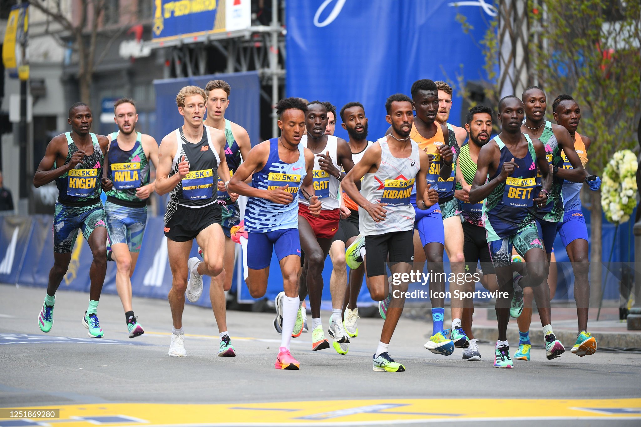
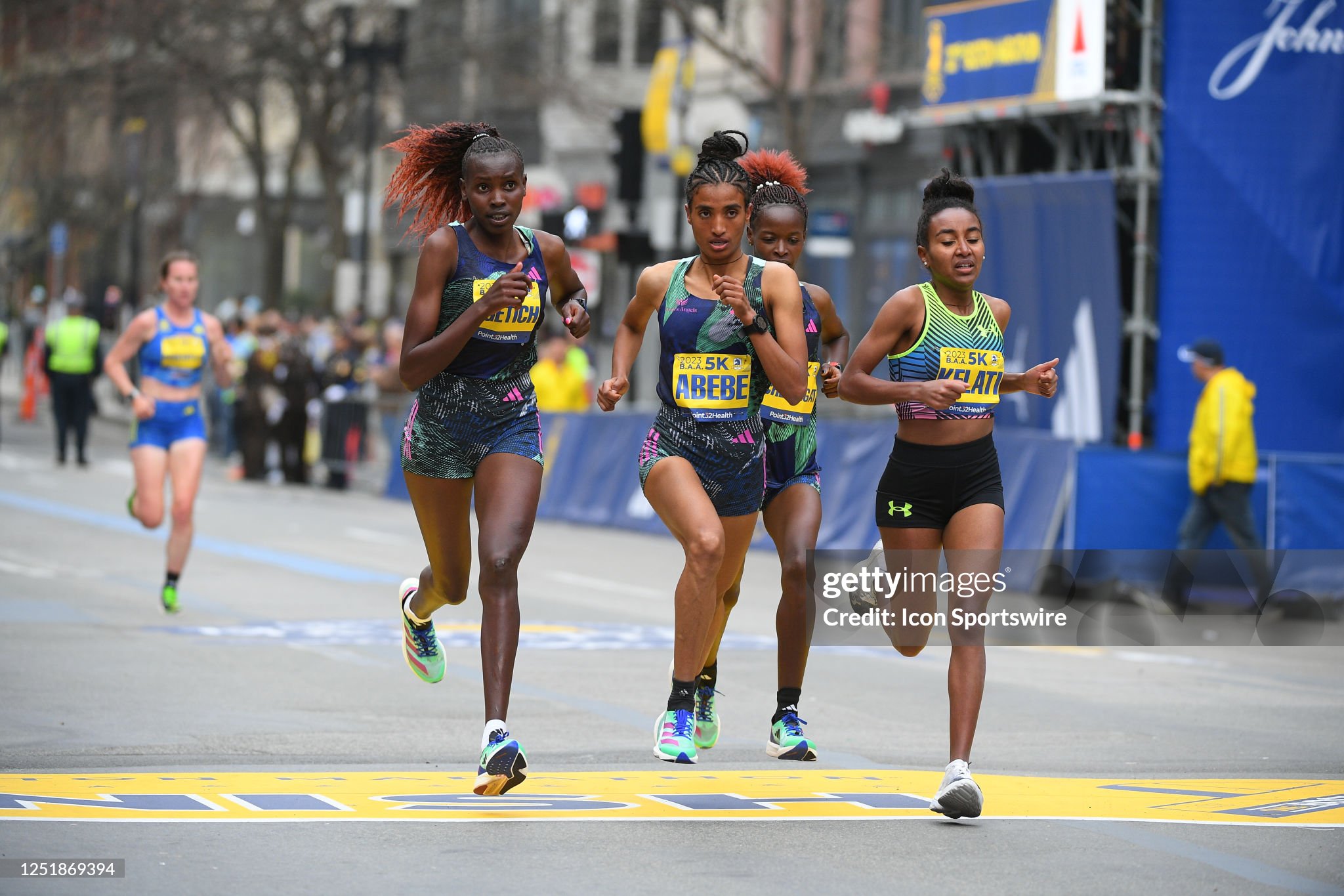
Adidas' kits: um, they look cool close up, but from far away they're really, really dark and messy looking. But I appreciate that Adidas is using patterns that we've not seen before and, like their leopard print womens' bottoms from last year, they're willing to push the envelope. And, from a TV perspective, I wish that you didn't put dark skinned men in very dark colored racing kits. Its hard to see them, and to differentiate in a pack on TV or on a computer screen. As a fan who likes watching running to keep and eye on all the different races in the pack, please make it easy for me to pick runners out.
Like the under armour kit. Very 2020's in colors and patterns, but easy to pick out visually. Thats a very good thing.