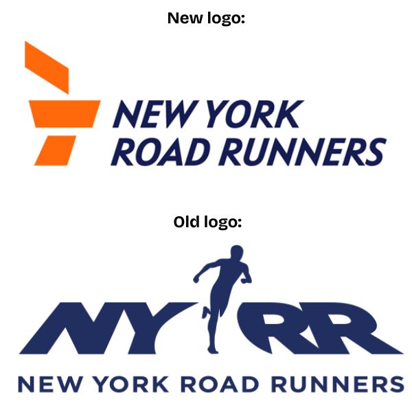
Here's an image of the new logo and the old one:
So the most basic question is what are your thoughts? You like the new one better or the old one? Poll going up on homepage.
Here's an image of the new logo and the old one:
So the most basic question is what are your thoughts? You like the new one better or the old one? Poll going up on homepage.
Looks like something a 3rd grade art class put together.... In other words it looks like sh#t
Bring back the 2002 logo
I know they're going to say using a male silhouette isn't inclusive so that had to drop it, but in 2026 who's to say it's male.
2000 logo was best, hands down.
I get why they're doing blue and orange (Mets), but the 2012 logo is the best.
I cannot make heads or tails out of what the new logo is supposed to represent. The old logo was nothing special either, but at least it conveyed the basic point.
In an effort to over-stylize and abstract, the logo lost all of its soul. Most modern logos suffer from the same, and it says a lot about the team involved in its design.
The 2002 logo is probably the best of all of them.
The 2012 has the right idea but it's not very balanced between the copy and the runner.
The new logo is great for a new bank.
Les wrote:
I cannot make heads or tails out of what the new logo is supposed to represent. The old logo was nothing special either, but at least it conveyed the basic point.
Is it not the torch that the Statue of Liberty is holding? And kinda stylized to make it look like its moving from left to right?
The running man is fine.
Are they going to organize training sessions around Statue of Liberty island? Or are they sticking to Central Park.
The 2002 logo is the best one. The new one is trash.
You paid a design firm for THIS??
Would have cost a hell of a lot less just to hire a few designers on Fiverr and then hold a vote on which people like best.
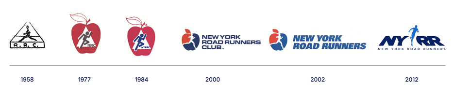
And the typeface from 2000 is better. They should have kept it when they dropped « club »
5 posts were removed from this page.