This thread was deleted by a volunteer moderator. I certainly don't want a thread this big deleted so I've restored. THat being said, this thread has served it's purpose. I've closed it to new posts.
We have a new 2024 vaccine thread here. New people don't need to try to wade through 20,000 posts to figure out what is going on.
That's quite different from the CDC data. I don't have the time to figure out if there is concordance and it's just a excess threshold issue of they have different underlying numbers.
Yes... 200k extra deaths a year would be extremely noticeable (see: COVID). So I suspect this is just OECD threshold errors.
Given we haven’t seen a rise in total deaths, or deaths of specific cause, seems unlikely that anything but that. I’ll report back shortly. But I note that you are not doing any of the legwork to understand anything.
I discovered the difference. The OCED uses average deaths for a given week over the years 2015-2019 for the baseline deaths to compare to. Because deaths have been increasing each year in the US due to a growing and aging population, this results in a much lower excess deaths threshold than the CDC uses with a more sophisticated modeling technique.
That's why the CDC's excess death threshold is higher than OCED and why there are more 'unexplained' deaths for the OCED – their simple model for expected deaths doesn't take into account population growth or aging, and they acknowledge as much.
Long story short, the CDC's model is more complete, and therefore more trustworthy. There are not that many 'unexplained' excess deaths – it's almost all COVID.
That's quite different from the CDC data. I don't have the time to figure out if there is concordance and it's just a excess threshold issue of they have different underlying numbers.
Yes... 200k extra deaths a year would be extremely noticeable (see: COVID). So I suspect this is just OECD threshold errors.
The OECD dataset reports 600k more excess deaths than the CDC dataset since 2020.
Clearly different thresholds being used.
There's a consistent surplus in the OECD data - so consistent that it would take some odd reasoning to imply that something nerfarious is just consistently killing exactly 3000 extra people per week.
I discovered the difference. The OCED uses average deaths for a given week over the years 2015-2019 for the baseline deaths to compare to. Because deaths have been increasing each year in the US due to a growing and aging population, this results in a much lower excess deaths threshold than the CDC uses with a more sophisticated modeling technique.
That's why the CDC's excess death threshold is higher than OCED and why there are more 'unexplained' deaths for the OCED – their simple model for expected deaths doesn't take into account population growth or aging, and they acknowledge as much.
Long story short, the CDC's model is more complete, and therefore more trustworthy. There are not that many 'unexplained' excess deaths – it's almost all COVID.
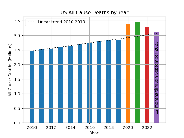
To help visualize this I have the following graphic of US Total Deaths by year. As a naive projection of expected deaths, I've plotted the linear trend from 2010 through 2019. This chart originated in 2021 as a counterpoint to the "It's just like the flu" dumbfvckery that was a prominent "skeptic" talking point at that time.
The rising linear trend is largely attributable to population growth and a generally aging population.
Notably, the winter of 2017-2018 was the worst flu season of the decade.
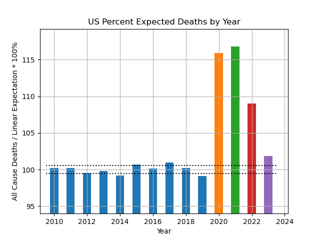
An alternative view of this data is to show deaths as a percent of expectation using the same decade pre-covid linear trend as the expectation which gives this:
Here we see that 2023 deaths are a shade under 2% above our naive expectation or on the order of 62000 excess deaths in 2023 using this "back of an envelope" estimation approach.
Note that the data source is CDC WONDER which currently has provisional data to September 2023.
This post was edited 4 minutes after it was posted.
I discovered the difference. The OCED uses average deaths for a given week over the years 2015-2019 for the baseline deaths to compare to. Because deaths have been increasing each year in the US due to a growing and aging population, this results in a much lower excess deaths threshold than the CDC uses with a more sophisticated modeling technique.
That's why the CDC's excess death threshold is higher than OCED and why there are more 'unexplained' deaths for the OCED – their simple model for expected deaths doesn't take into account population growth or aging, and they acknowledge as much.
Long story short, the CDC's model is more complete, and therefore more trustworthy. There are not that many 'unexplained' excess deaths – it's almost all COVID.
To help visualize this I have the following graphic of US Total Deaths by year. As a naive projection of expected deaths, I've plotted the linear trend from 2010 through 2019. This chart originated in 2021 as a counterpoint to the "It's just like the flu" dumbfvckery that was a prominent "skeptic" talking point at that time.
The rising linear trend is largely attributable to population growth and a generally aging population.
Notably, the winter of 2017-2018 was the worst flu season of the decade.
An alternative view of this data is to show deaths as a percent of expectation using the same decade pre-covid linear trend as the expectation which gives this:
Here we see that 2023 deaths are a shade under 2% above our naive expectation or on the order of 62000 excess deaths in 2023 using this "back of an envelope" estimation approach.
Note that the data source is CDC WONDER which currently has provisional data to September 2023.
Thanks this is super nice to see, as always.
For reference, the OECD excess deaths baseline would be ~the 2017 death total according to their method. You can see how this method would drastically overestimate excess deaths by ignoring the population trends, leading to the discrepancy fisky stated.
Totally agree about the tennis rabbit hole that's been going on here for the past few weeks.
I'm curious how you stumbled upon the OECD data for excess deaths. That is, I'm guessing you found it on somebody's blog or some such and I'm interested in who is originating these sort of narratives and how they propagate through social media.
To be blunt, I'm trying to wrap my head around why there is widespread distrust of the historically most plausible sources of expertise (e.g. the CDC) and how that trust gets transferred to sources with, generally, an objectively poor record of being trustworthy.
Can we get a correlation of vaccine doses/person vs. grand slam singles winning % by country?
Totally agree about the tennis rabbit hole that's been going on here for the past few weeks.
I'm curious how you stumbled upon the OECD data for excess deaths. That is, I'm guessing you found it on somebody's blog or some such and I'm interested in who is originating these sort of narratives and how they propagate through social media.
To be blunt, I'm trying to wrap my head around why there is widespread distrust of the historically most plausible sources of expertise (e.g. the CDC) and how that trust gets transferred to sources with, generally, an objectively poor record of being trustworthy.
Joking about tennis aside, the huge amount of data online means that you can find some combination of numbers that seems to support your pet theory. Actually vetting the sources or taking the time to understand analytic techniques is optional.
It's immensely frustrating because grifters can just dump a huge spreadsheet and associated graphs and people will just eat it up. Meanwhile, the amount of research and work to actually refute the data can take serious digging and will be met with extreme skepticism for challenging the favored grifter narrative.
To be blunt, I'm trying to wrap my head around why there is widespread distrust of the historically most plausible sources of expertise (e.g. the CDC)
Where have you been these last 4 years ? Under a rock ?
Mindy (or whatever she calls herself) continues to maintain this CDC policy first reported in February 2022:
"The C.D.C. Isn’t Publishing Large Portions of the Covid Data It Collects"
"For more than a year, the Centers for Disease Control and Prevention has collected data on hospitalizations for Covid-19 in the United States and broken it down by age, race and vaccination status. But it has not made most of the information public."
The CDC has published basically the most complete set of COVID data of any country in a the world. One article from 2 years ago doesn't change that. You're a bad, old broken record, Dan.
To help visualize this I have the following graphic of US Total Deaths by year. As a naive projection of expected deaths, I've plotted the linear trend from 2010 through 2019. This chart originated in 2021 as a counterpoint to the "It's just like the flu" dumbfvckery that was a prominent "skeptic" talking point at that time.
To help visualize this I have the following graphic of US Total Deaths by year. As a naive projection of expected deaths, I've plotted the linear trend from 2010 through 2019. This chart originated in 2021 as a counterpoint to the "It's just like the flu" dumbfvckery that was a prominent "skeptic" talking point at that time.
Totally agree about the tennis rabbit hole that's been going on here for the past few weeks.
I'm curious how you stumbled upon the OECD data for excess deaths. That is, I'm guessing you found it on somebody's blog or some such and I'm interested in who is originating these sort of narratives and how they propagate through social media.
To be blunt, I'm trying to wrap my head around why there is widespread distrust of the historically most plausible sources of expertise (e.g. the CDC) and how that trust gets transferred to sources with, generally, an objectively poor record of being trustworthy.
I did a search on Bing Copilot and ChatGPT, but I couldn't find data showing what I was looking for. Then, searched on Google for "excess death rate us by month". One of the links on the first page of links was to this OECD page. I then had to select United States for country and for variables, I chose excess deaths and Covid-19 deaths. For week 1, the difference was 5,000, week 2: about 2,000, week three: about 1,500 and so on. Just eyeballing the data, it appeared that there were around 3,000-4,000 non-covid excess deaths each week in 2023.
To be blunt, the CDC has lost a lot of credibility throughout the Covid pandemic. The CDC was constantly behind the power curve in 2020, gave out a lot conflicting information, and Walensky came across as incompetent in the May 2021 Congressional hearings when she claimed that she didn't know how many OF HER OWN EMPLOYEES had been vaccinated. (This was one month after Pres. Biden had announced a national push to get everyone vaccinated.)
37% of Americans do not trust the CDC, according to recent poll.
Help us build the best running shoe review site for a chance to win a LetsRun t-shirt.Help us build the best running shoe review site for a chance to win one of 10 LetsRun t-shirts.